In this article, we are going to learn about flexbox, what is flexbox, why flexbox very important property in CSS, how it is work, and how we can use flexbox. In this article, I don't write lots of text on different properties, I have tried to show more practical work to learn flexbox. So let's start.
What is Flexbox?
Flexbox is a new layout property in CSS. With the help of flexbox, we can easily maintain the collection of elements. It provides some properties with the help of them, we can design webpages with less effort. It is a one-dimensional layout at a time. You can use it column-wise or row-wise.
There are two main parts in flexbox. First is flex-container and Second is flex-items. Flex-container has flex-items. Flex-Container is a big box. Under the flex-container, there are lots of elements that we called flex-items.
Importance of Flexbox
Flexbox is a very important property for every front-end developer. Because it provides flexibility to the container to best use the height and width of the container to layout the flex items. If you use normal properties of CSS to arrange the flex items then you have to work hard and also have to write lots of CSS to achieve the goal which you want. But with the help of flexbox, you can easily achieve the goal with fewer efforts and fewer lines of code. That's why Flexbox is a very important property for front-end developers.
Flex-Container Properties
Before using any property of flexbox you have to declare the parent element(flex-container) to display: flex; like the below shown
.flex-container {
    display: flex;
}
I am not going to write full code for explaining every property. So you can refer started code for your practice and use different properties on that started code.
There are some flexbox properties which is applied to flex-container. So let's see each property one by one and how they work.
flex-direction
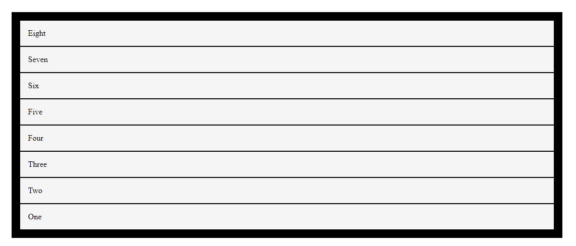
This property is used to specify the direction of flex items. There are four values for a flex-direction property that we can use for the direction of flex items. There are only two directions row and column but we can use these two directions in two different ways.
flex-direction: row;flex-direction: column;flex-direction: row-reverse;flex-direction: column-reverse;row: - By default, every flex-container flex-direction value is row.

column: - This value changes the flow of flex items in the column.

row-reverse: - This value changes the flow of flex-items into rows but flex-items align in reverse order(right to left).

column-reverse: - This value changes the flow of flex-items into column but flex-items align in reverse order(bottom to up).

flex-wrap
The flex-wrap property specifies whether the flex items should wrap or not. If width is not available for flex-items then if you use wrap value it automatically wraps the row into another row.
flex-wrap: wrap;flex-wrap: nowrap;wrap: - break the row if space is not available for flex items.

nowrap: - flex-items flow in one direction if space is not available for flex-items from its parent.

flex-flow
flex-flow property is a shorthand method for applying both properties flex-direction and flex-wrap together.
flex-flow: row-reverse wrap;
justify-content
justify-content defines the alignment of the flex-items along with the main axis(means depends on the flex-direction). It sets all flex-items inside the flex container according to the available free spaces on the main axis. There are six different values for the justify-content property which behave differently.
justify-content: flex-start;justify-content: flex-end;justify-content: center;justify-content: space-around;justify-content: space-between;justify-content: space-evenly;
flex-start: - It is the default value of the justify-content property. It arranges the flex-items to the start of the flex-container according to the main axis.

flex-end: - This value arranges the flex-items to the end of the flex-container according to the main axis.

center: - This value aligns the flex-items to the center of the flex-container according to the main axis.

space-around: - Display the flex-items with space before, between and after the lines.

space-between: - Displays the flex-items with space between the lines.

space-evenly: - Displays the flex-items with even space around them.

align-items
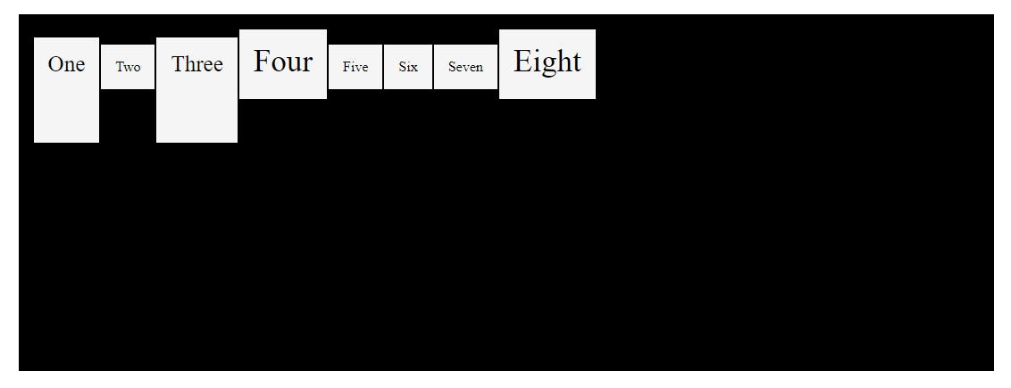
This property aligns the flex-items into the flex-container in cross-axis. It normally used for vertical alignment of the flex-items. There are five values of align-items property:
align-items: stretch;align-items: flex-start;align-items: flex-end;align-items: center;align-items: baseline;stretch: - It is a default value of flex-container. This value stretches the flex-items to fill the flex-container with respect to the min-width/max-width.

flex-start: - This value aligns the flex-items start of the container to the cross-axis.

flex-end: - This value aligns the flex-items to the end of the container to the cross-axis.

center: - This value aligns the flex-items to the middle of the flex-container to the cross-axis.

baseline: - This value aligns the flex-items according to their text baseline.

gap
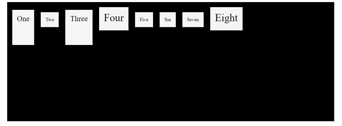
The gap property explicitly controls the space between flex items. It applies that spacing only between items not on the outer edges.
gap: 20px;
Flex-Items Properties
Some flex-items-based properties apply to flex-items elements.
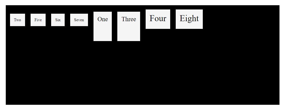
order
The order property specifies the order of the flex items. For example, as shown in below there are flex-item 1,3,4 and 8 order has changed after applying order: 2; property.

flex-grow
The flex-grow property specifies how much a flex item will grow relative to the rest of the flex items. The value must be a number, the default value is 0. Here I used the flex-grow property on flex-item 1 and 5.
flex-grow: 2;
flex-shrink
The flex-shrink property specifies how much a flex item will shrink relative to the rest of the flex items. The value must be a number, the default value is 1. Here I used the flex-shrink property on flex-item 3.
flex-shrink: 0;
flex-basis
This CSS property specifies the initial size of the flex item. It only works on the flex-items, so if the container's item is not a flex-item, the flex-basis property will not affect the corresponding item.
flex-basis: 200px;

align-self
The align-self property specifies the alignment for the selected flex-item inside the flex-container. The align-self property overrides the default alignment set by the flex-container align-items property. There are three values of align-self property flex-start, flex-end and center. Here I applied the align-self property on flex-items 1,3 and 4.

Conclusion
So we saw how flexbox works in CSS. How to use different properties of flexbox. When to use different properties according to their behavior. And here, we also saw which property is used in flex-container or flex-items.
So that's it for now. If you have any doubt then please comment, and if you learn something from this article, please like it.
